![You are currently viewing CRAP Design: 4 Core Principles to Learn [+Examples]](https://www.hoothemes.com/wp-content/uploads/2021/10/Shh-Dont-Share-This-Insider-Secret-About-Crap-Design-Principles-1.jpg)
Using CRAP design principles is an amazing way to create an effective visual design.
You’re surely surprised now if you had never heard of CRAP before. Robin Patricia Williams, an awesome American author who wrote many computer-related books, has described a set of graphic design principles in her book, The Non-Designer’s InDesign Book. She called it CRAP. (You can also read a brief interview with her here).
what is CRAP Design?
CRAP is an acronym that stands for Contrast, Repetition, Alignment, and Proximity.
To create effective, eye-catching designs, we should be consistent. Consistency comes with implementing basics and fundamentals that are always needed. These basics are the very bare essentials that any designer should constantly consider.
As a graphic designer, your job is to produce something that mesmerizes the viewer in a way they cannot leave the website. Viewers need to be glued to their seats with your gripping graphic design, and for that, comes CRAP.
Pro Tip: Check out Creative Fabrica for awesome free fonts, graphics, and designs!
4 CRAP Design Principles
Crap Design Principle #1: Contrast
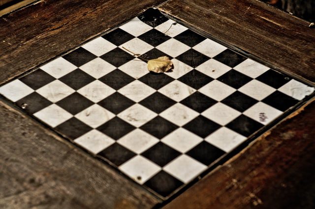
Contrast is described as the “juxtaposition of dissimilar elements (such as color, tone, or emotion) in a work of art.” Contrast is the thing that makes elements stand out. Before getting into it, there is one tip you should consider.
If you use a contrasting feature too many times, you are simply reducing the contrast, not increasing it. Why? Because contrast means what it means when you want a few elements to stand out. If everything stands out, nothing stands out! As an important element in crap design principles, you must know how to use it well. So, let’s get to it!

You can use the difference in colors to create contrast. The World Wide Web Consortium (W3C) has created guidelines on the minimum contrast needed between text and its background. Although having a high contrast is a must when it comes to text and background, this is not true when we talk about different elements.
Applying high contrast between different elements can strain the users’ eyes. You can look at a grayscale version of your design to see if optimum contrast has been used or not.
As a rule of thumb, using shades of complementary colors that do not create eye-straining high contrast can be a good practice.
Size

The differences in elements’ sizes, especially when it comes to text, can be a source of contrast. Keeping an element’s size significantly larger than others surrounding it will make it eye-catchy. Call-to-action (CTA) buttons can benefit from this larger size as well. Your viewers will notice them more and they help you with your CRO. Also, if you need more help with your CRO strategies, check this guide.
Shape
Having different shapes can generate the contrast you are looking for. You can see the contrast in shape used in infographics effectively. The use of dissimilar shapes next to each other can help with engaging the readers’ minds. Adding round corners to quadrilateral shapes or using square elements together with round, circular elements can also be examples of contrast in shape.
Font
We can categorize fonts into different groups. Serif, Sans-serif, script, monospaced, and display are the basic typescript classifications. Using different font groups can create contrast for the text we want to be signified. Also, using different font weights (bold or regular), font styles (italics, opaque, or normal), and font decorations (underline, strikethrough, etc.) can take your game to the next level.
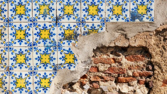
Crap Design Principle #2: Repetition
As human beings, our minds are programmed into liking patterns; We search for them everywhere. What creates patterns? Repetition! Also, we create a sense of identity when we encounter a repetition of things. Think of a piece of music that the main themes do not get repeated. You would feel lost.
The exact same thing happens in design. We need to repeat colors, shapes, textures, sizes, and other attributes in our design to make it consistent and give it some kind of identity. Also, companies use repetition in design to build brand awareness. They repeat a predefined set of colors and fonts to bring consistency to their different platforms and channels.
Repetition in design is another important principle in the four CRAP principles of design. The user needs to feel safe, not lost. It helps optimize your website’s UX.
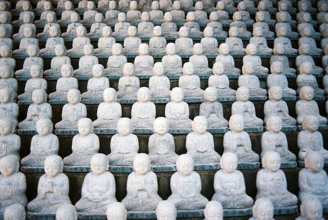
Crap Design Principle #3: Alignment

Alignment, as another crucial factor in CRAP design principles, specifies the positioning of an element in the design. It is what gives cohesion and a sense of order to a design. In terms of elements, you can align them based on their edges or their centers. However, texts can be aligned to left, right, or center, or can simply be justified.
Depending on the text language used, the left and right alignments, being LTR or RTL, are the most popular ones. We can use center alignment for short text spans (but is difficult to read on longer texts). Justification is a good choice when the line length is long, the font size is small, and the words are shorter (using it on narrow lines that consist of long words reduces readability).
Each design should have some vertical lines that act as horizontal alignment guides. Text floating everywhere on the page just confuses your viewer. Your viewers should simply be able to realize the relation of every part of the page to one another.
Crap Design Principle #4: Proximity

Last but not least, proximity is another principle that plays a vital role in CRAP design. Proximity in design states that we should put elements that relate to one another and are associated with each other closely. It makes sense, doesn’t it? You do not want to look for a link related to the article you are reading in the navbar, do you? Also, spacing elements evenly throughout the page makes the design harder to follow. Group the related elements as much as possible to make it easier for your viewer to find the desired information.
Make sure to master these items! Because whether you’re creating a website design or print design, these principles can help you improve your designs.
The 3 Second Rule
“It takes just 3 seconds to fall in love.”
So, the final test you can go for to see if your CRAP design is impeccable is to check if it is effective in 3 seconds. You can do it yourself by clearing your mind and looking away, then coming back at it. You also can ask a friend or a relative for their opinions after 3 seconds. We decide whether something attracts us and whether we want to continue with it or not in just 3 seconds.
The Relationship
We should not use these principles in isolation. Repetition and alignment work together to provide the “normal” state, which enables you to change the shape or location of a piece of text to generate contrast. Furthermore, repetition and proximity work together to produce effective formats such as bulleted lists – the repetition of the bullet lends emphasis to the points’ proximity.
Wrapping Up All the Principles of CRAP Design
Oscar Wilde, in the preface of his most famous book, “The Picture of Dorian Gray,” says, “The artist is the creator of beautiful things. To reveal art and conceal the artist is art’s aim.”
Finally, the objective is for the effort you put into creating a document to vanish, to become invisible, allowing your reader or viewer unrestricted access to the ideas you are attempting to communicate — both directly in your text and ever-so-subtly, via your choice of design components. In this regard, it is a thankless job since few people will remark on (or even notice) the design quality — but they will notice and act on the message. Isn’t that what it’s all about?

![Read more about the article WordPress Website Design Guide for 2022 [+10 Helpful Tips]](https://www.hoothemes.com/wp-content/uploads/2022/09/WordPress-Website-Design-Guide-10-Bonus-Tips-300x157.png)