So you’re generating quality leads and getting more visitors every day. How to convince them to convert into buyers? In this article, you will read about the best landing page designs that convert visitors into buyers.
Do you want to improve your landing page design, decrease your bounce rate, and increase your conversion rate? Knowing what makes a strong landing page and seeing a few instances of these features in action will help remarkably.
What is a Landing Page?
A landing page is a web page that serves as a bridge between your platform and your website. Landing pages can urge visitors to do specific activities in response to an e-commerce marketing campaign. As a result, a landing page may be an essential component of your conversion funnel, where your leads can convert. Knowing how important a landing page is, you should make it stand out by engaging.
You can ask a team of website developers to create your landing page or use custom website designs such as WordPress, Wix, etc.
What Makes a Landing Page Effective?
Here are the basic principles you should consider when creating high-converting landing pages:
- Use a clear value statement for your landing page.
- Make every effort to create a fantastic UI/UX design.
- Match your main title to the CTA that drew your visitor to the page in the first place.
- Include social proof and consumer evaluations or testimonials to boost trust.
- Use only one key CTA.
- Use a conversion-oriented layout for your CTA.
- Never forget A/B testing.
Qualities of a High-Converting Landing Page Design
Let’s take a look at some of the elements that make up a successful landing page:
- A high-resolution and captivating photo
- Clear title
- Textual body
- CTA
So, an effective landing page has both textual and visual content. Remember to keep them closely relevant as well as informative.
Landing Page Designs That Will Convert Visitors into Buyers
Now that we’re aware of what a landing page is and what features make it effective in driving conversion, let’s go over the top 10 landing page examples. You’ll notice how excellent these landing pages are designed to hook visitors and turn them into customers.
1. Shopify
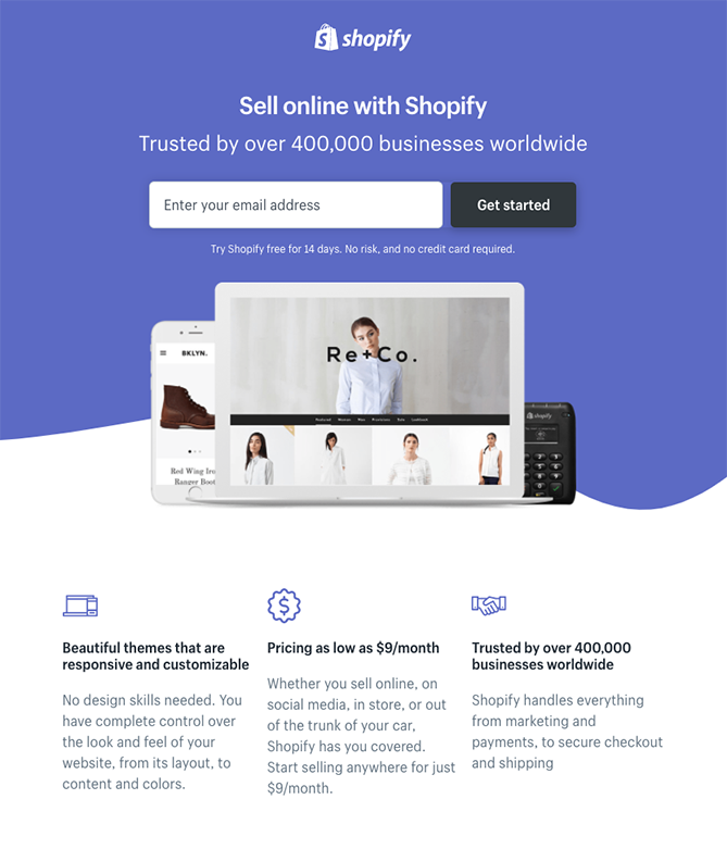
The landing page for Shopify is straightforward. Let’s learn a lesson: if you want a lower bounce rate and a higher conversion rate, your landing page must be far from complications.
On Shopify’s landing page, the user-friendly title is merely a few words long. Rather than paragraphs, the text is supplemented by simple bullets. Before you begin, there is only one field that you must complete as a website visitor. And that one field asks for a vital piece of information which is the email address. Growing an email recipient list can make your email marketing campaigns more effective and huge.
2. Netflix
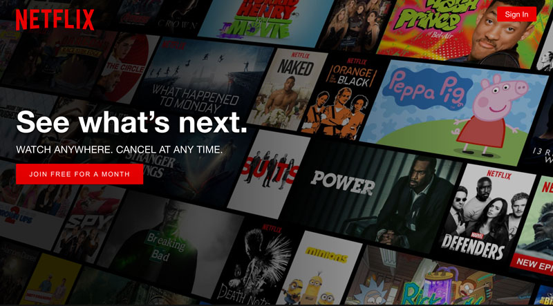
The Netflix landing page is all on minimalism and simplicity. The content is simple and to the point. The CTA stands out in its well-known Netflix red color, and the cover photo is instantly recognizable to anyone who has seen at least one Netflix movie or series.
While our gut tells us that the color red denotes danger, Netflix has employed it to great effect in its CTA button. The reason for this is that the color red has earned Netflix a name, and no one identifies it as a warning sign when they visit Netflix’s landing page.
3. Uber

Uber’s landing page is simple again, with only the components necessary to entice driver registration. The headline takes up around 20% of the landing page, making it the first thing you see when you enter. The page is dominated by type and image, which take up 75% of the space and shorten the form’s length.
4. Apple
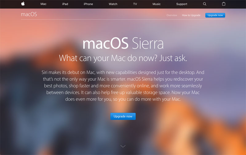
Apple’s landing page interacts with the user cleverly (much like Apple’s goods!). The user is presented with a full menu, message, and call to action at first. On Apple’s landing page, though, the visitor may see much more. They can no longer see the same stuff if they scroll down. Instead, they can view the website’s content.
The CTA button is so well-designed and clean that it makes you feel like you’re on Apple’s landing page, where everything is elegant and sophisticated.
5. Airbnb
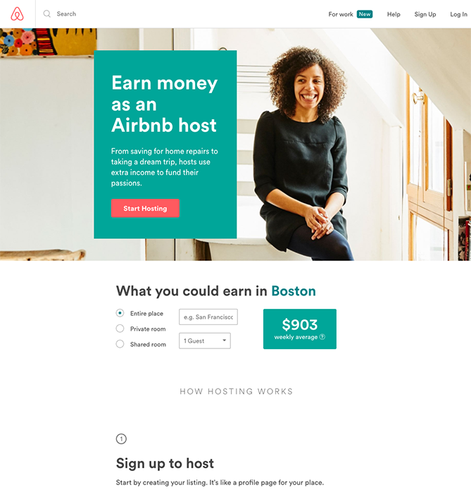
Airbnb provides tempting options to aid in converting tourists into hosts, like a predicted weekly average revenue prediction depending on your region. For a more tailored quote, fill in more details about your desired accommodations in the fields.
The design of this landing page is basic and appealing to the eye. A high-quality, relevant photo fills most of the spaces on the landing page, making it more engaging—furthermore, the wide and clear headline and the easy-to-reach CTA aid conversions for Airbnb.
6. TransferWise
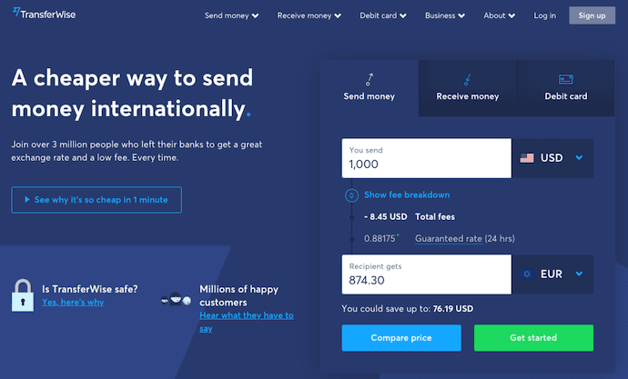
TransferWise lets you transfer and receive money in various currencies, and its landing page breaks down each step so you don’t get sidetracked by alternatives that aren’t relevant to you.
If you want to send money, you can fill out the transfer form on the right. Go to the middle tab to receive money, and sign up for TransferWise using your debit card; go to the right tab.
Each tab on this landing page generates a separate call-to-action based on what you’re signing up for, each of which is highlighted in a brilliant green box to emphasize your next step following your three options.
7. Nauto
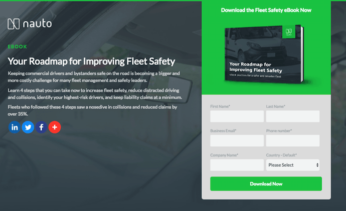
Nauto is a data platform for self-driving automobiles that helps make self-driving safer. Customers would, of course, require a wealth of information to sell them on this platform. Nauto has a super-easy ebook with a landing page with a small contact form and some sample statistics to demonstrate why this resource is so valuable.
A warm shot of a car’s interior is on the landing page, together with the lead-capture form at the top of the page, as shown above. It’s possible that the green “Download Now” button was added on purpose regarding the green color in the traffic lights.
8. IMPACT
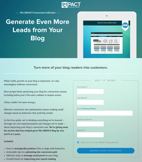
The landing pages of IMPACT have long served as a source of design inspiration. The page’s straightforward layout is appealing, from the huge headline content and detailed featured image to the outline surrounding the form and the eye-pleasing colors and fonts.
9. Bills.com

People frequently mistake landing pages for static pages on your website. You can, however, make them interactive and personalized with the correct tools.
On Bills.com, you must first answer three questions to see if you might benefit from their consultation before providing a form. So, you will categorize yourself as a website visitor, and they can better manage their clients.
10. Conversion Lab
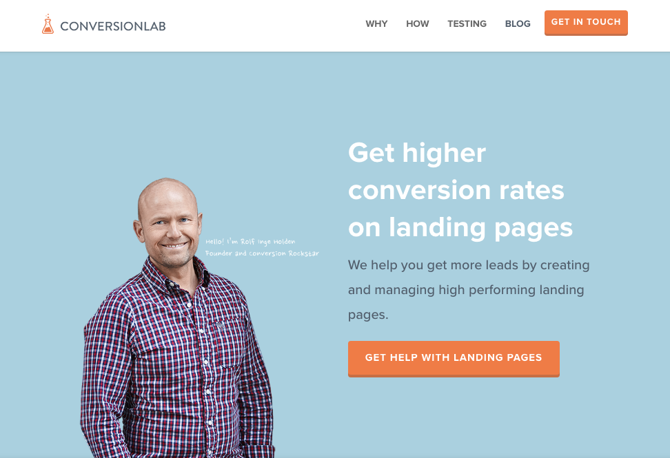
On Conversion Lab, the entire landing page shifts to make room for the form when you click “Get Help With Landing Pages.” Check out how the form looks when you click that CTA:
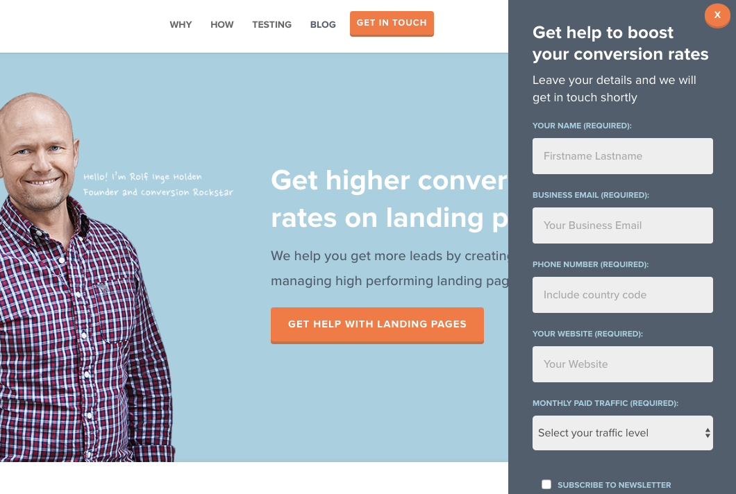
The good thing about this landing page design is that you don’t have to leave the page to see the form. The design of the landing page is again simple, and every element is easy to find.
Final Words on High-Converting Landing Page Designs
A well-optimized landing page can convert visitors into buyers by gathering information to help you better understand your website visitors. Because landing pages are important for conversions, it’s critical to ensure they’re well-thought-out, developed, and implemented.
The landing page design examples mentioned in this post can give you some ideas about designing your own landing page. So without delay, get to work and start creating a high-converting landing page for your website and see how effectively it can drive more conversions.
Read more:
- What Is a Web Session Replay Tool?
- Best Conversion Rate Optimization Tools
- What is a Microsite?
- A Marketer’s Experience with Hotjar
- Best Free & Paid Session Replay Tools
- What is Website Visitor Tracking?
- Lucky Orange Reviews
- Behavioral Targeting: A New Approach
- What is a Website Heatmap
- Best CRO Platforms to Boost Conversions
- Google Analytics Heat Mapping
- What is Psychographic Segmentation?


![Read more about the article CRAP Design: 4 Core Principles to Learn [+Examples]](https://www.hoothemes.com/wp-content/uploads/2021/10/Shh-Dont-Share-This-Insider-Secret-About-Crap-Design-Principles-1-300x182.jpg)

![Read more about the article WordPress Website Design Guide for 2022 [+10 Helpful Tips]](https://www.hoothemes.com/wp-content/uploads/2022/09/WordPress-Website-Design-Guide-10-Bonus-Tips-300x157.png)